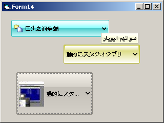
ctlUniComboImageXP Control
Unicode Combo ListBox with optional images
Check common properties here
Enums
| Name | Description |
|---|
Events
| Name | Description |
|---|---|
| KeyDown | |
| KeyPress | |
| KeyUp | |
| Click | |
| DblClick | |
| MouseDown | |
| MouseMove | |
| MouseUp | |
| MouseWheel | Raised when the mouse wheel scrolls |
| Resize | |
| OnOwnerDraw | Raised when an item is about to be drawn. Change properties of this event for translating items at runtime or assign icons to items. This event is called the first time for measuring the item then every time the item needs to be refreshed |
| BeforeDropDown | Raised before dropping down the list |
| AfterDropDown | Raised before closing the drop down list |
| ItemSelecting | Raised when selecting an item in the drop down list |
| OLEStartDrag | |
| OLESetData | |
| OLEGiveFeedback | |
| OLEDragOver | |
| OLEDragDrop | |
| OLECompleteDrag |
Properties
| Name | Type | Description |
|---|---|---|
| AllowImages | (Boolean) | Gets or sets the ability to use images in the combo |
| BackColor | (OLE_COLOR) | Gets or sets the Background color of the control |
| BackColorOut | (OLE_COLOR) | Gets or sets the Color of the area out of the border (when using Rounded Borders in a non WindowLess control) Leave -1& for automatic management |
| BorderColor | (OLE_COLOR) | Gets or sets the Border color |
| ButtonBackColor | (OLE_COLOR) | Gets or sets the button background color |
| ButtonForeColor | (OLE_COLOR) | Gets or sets the button foreground color |
| ButtonStyle | (eCtlButtonStyle) | Gets or sets the style of the combobox |
| DropDownOnTextClick | (Boolean) | Gets or sets the ability to show the combo list when a user click on the control with the mouse |
| DropDownWidth | (Long) | Gets or sets the width of the drop down list |
| Enabled | (Boolean) | Enables or disables the control |
| Font | (Font) | Gets or sets the font used for text in the control, check the [ApplyFontChanges] for details |
| ForeColor | (OLE_COLOR) | Gets or sets the text color |
| HScroll | (Boolean) | Gets or sets the ability to use a horizontal scrollbar on the popup list |
| IconDim | (Integer) | Gets or sets the default size of item images |
| ItemData | (Long) | Gets or sets the [ListTag] but limited to be a number |
| List | (String) | Gets or Sets the item at a certain index |
| ListCount | (Long) | Returns the number of items in the list |
| ListIndex | (Long) | Gets or sets the current element |
| ListTag | (Variant) | Gets or sets the Tag associated with a certain list item |
| MouseIcon | (Picture) | Gets or sets the MouseIcon for the control |
| MousePointer | (VBRUN.MousePointerConstants) | Gets or sets the MousePointer for the control |
| OLEDropMode | (eCtlOLEDropMode) | Gets or sets the OleDropMode for the control |
| OwnerDrawState | (eOwnerDrawState) | Gets the OwnerDraw status, by checking this flag you can load items (icons or images) only when needed |
| RightToLeft | (Boolean) | Gets or sets the ability to show bidirectional text on the control |
| RoundedBorders | (Boolean) | Gets or sets Rounded borders |
| RoundSelector | (Boolean) | Gets or sets the ability to use rounded borders for the list item selector |
| SelBackColor | (OLE_COLOR) | Gets or sets the background color of the list item selector |
| SelectorStyle | (eCtlButtonStyle) | Gets or sets the style of the list selector |
| SelForeColor | (OLE_COLOR) | Gets or sets the foreground color of the list item selector |
| Sorted | (Boolean) | Gets or sets the ability to sort items alphabetically |
| Text | (String) | Gets or sets the text of the control |
| Tip | (String) | Gets or sets the Unicode Tooltip for the control |
| UseRoundRegions | (Boolean) | Gets or sets the ability to use Round Regions for round borders instead of using the [BackColorOut] property; |
Methods
| Name | Type | Description |
|---|---|---|
| AddItem | (Long) | Adds a new item in the combobox list and returns the index |
| ApplyFontChanges | When setting a new font on the control you need to call this function in order to refresh the interface | |
| BeginUpdate | Permits you to start a long-time update on the control (for example by adding 1000 elements) without sending out many and many events. So it is faster! Use un conjunction with [EndUpdate] |
|
| Clear | Clears the list combo | |
| CloneFrom | Clones data from another control | |
| DropDown | Opens or Closes the dropdown list | |
| EndUpdate | Terminates a [BeginUpdate] reactivating the control after a long-time update | |
| ForceLostFocus | Forces the control to lose the keyboard focus | |
| hWnd | (Long) | Retuns the handle associated with the control |
| IsDroppedDown | (Boolean) | Returns True if the combo list is dropped down |
| newIndex | (Long) | Returns the index of the latest item added |
| OLEDrag | Starts an OLEDrag operation | |
| RemoveItem | Removes the item at a certain position |
Remarks
How to use the control:
Load items using the [AddItem] method; you can specify an additional Tag to each item (for example you can specify an item picture)
Then manage the [OnOwnerDraw] event and set images to items when needed.
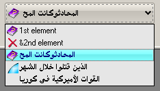
Load items using the [AddItem] method; you can specify an additional Tag to each item (for example you can specify an item picture)
Then manage the [OnOwnerDraw] event and set images to items when needed.
Private Sub Form_Load()
    With ctlUniComboImageXP1
        .AddItem "1st element", , MDIForm1.puGetPic(egii_help) 'Save the picture in the tag
        .AddItem "&2nd element", , MDIForm1.puGetPic(egii_x) 'Save the picture in the tag
        .AddItem oIni.ReadString("test", "arabic", "arabic"), , MDIForm1.puGetPic(egii_help)
        .AddItem oIni.ReadString("test", "arabic1", "arabic1"), , MDIForm1.puGetPic(egii_big)
        .AddItem oIni.ReadString("test", "arabic2", "arabic2")
        .ListIndex = 2
    End With
End Sub
Private Sub ctlUniComboImageXP1_OnOwnerDraw(ByVal lItemIndex As Long, sItemText As String, _
    oItemPic As stdole.Picture, iItemPicWidth As Integer, iItemPicHeight As Integer, bItemPicTransp As Boolean)

    'Only if the Tag has an object value
    If IsObject(ctlUniComboImageXP1.ListTag(lItemIndex)) Then
        Set oItemPic = ctlUniComboImageXP1.ListTag(lItemIndex)
    End If

End Sub