ucTreeView Control
Extremely powerful Unicode Treeview control, with multi-selection, derived from ucTreeview 1.3.
This controls doesn't use Classes for node management, a node is an handle (long value) and you can retrieve node properties by passing its handle.
Check common properties here
We have already planned the construction of a new TreeView control, 100% compatible with the standard VB6 one
Enums
| Name | Description |
|---|---|
| tvOLEDragConstants | OLED&D |
| tvOLEDragInsertStyleConstants | OLED&D |
| tvOLEDropConstants | OLED&D |
| tvRelationConstants | Node relation constants |
| tvScrollConstants | Scroll action constants |
Events
| Name | Description |
|---|---|
| Click | |
| NodeClick | Occurs when you click on a node |
| NodeCheck | Occurs when you check/uncheck a node |
| NodeDblClick | |
| SelectionChanged | Occurs when the current node changes |
| BeforeExpand | Occurs before expanding a node |
| AfterExpand | Occurs after having expanded a node |
| Collapse | Occurs after having collapsed a node |
| BeforeLabelEdit | Occurs before editing a node label, set Cancel = True to stop the action |
| AfterLabelEdit | Occurs after having changed a item label, set Cancel = True to stop the action |
| KeyDown | |
| KeyPress | |
| KeyUp | |
| MouseDown | |
| MouseMove | |
| MouseUp | |
| MouseEnter | |
| MouseLeave | |
| Resize | |
| OLEStartDrag | |
| OLEGiveFeedback | |
| OLEDragOver | |
| OLEDragDrop | |
| OLECompleteDrag |
Properties
| Name | Type | Description |
|---|---|---|
| AutoInitImageList | (Boolean) | Gets or sets the ability to auto initialize the internal image list; if you set this property to False you don't use images in the control and you'll not find also the space between icons and lines |
| BackColor | (OLE_COLOR) | Gets or sets the Background color of the control |
| BackColorOut | (OLE_COLOR) | Gets or sets the Color of the area out of the border (when using Rounded Borders in a non WindowLess control) Leave -1& for automatic management |
| BorderColor | (OLE_COLOR) | Gets or sets the Border color |
| CheckBoxes | (Boolean) | Gets or sets the ability for the control to display checkboxes near node icons |
| Enabled | (Boolean) | Enables or disables the control |
| Font | (StdFont) | Gets or sets the font used for text in the control, check the [ApplyFontChanges] for details |
| ForeColor | (OLE_COLOR) | Gets or sets the text color |
| FullRowSelect | (Boolean) | Gets or sets the ability to select an element by clicking on the area of the item row and not only in the item icon or text |
| HasButtons | (Boolean) | Gets or sets the ability to displat plus/minus buttons on nodes with children |
| HasLines | (Boolean) | Gets or sets the ability to display lines near nodes |
| HasRootLines | (Boolean) | Gets or sets the ability to group the root node with a line |
| HideSelection | (Boolean) | Gets or sets the ability to maintain the text selection visible also when the control has no focus (set HideSelection = False) |
| InsertMarkColor | (OLE_COLOR) | Gets or sets the insertion mark color |
| itemHeight | (Long) | Gets or sets the height of items |
| ItemIndent | (Long) | Gets or sets the indent value for items |
| LabelEdit | (Boolean) | Gets or sets the ability to edit labels |
| LineColor | (OLE_COLOR) | Gets or sets the line color |
| MouseIcon | (Picture) | Gets or sets the MouseIcon for the control |
| MousePointer | (VBRUN.MousePointerConstants) | Gets or sets the MousePointer for the control |
| NodeBackColor | (Long) | Gets or sets the background color of the given node |
| NodeBold | (Boolean) | Gets or sets the bold status for a node |
| NodeChecked | (Boolean) | Gets or sets the checked status of a node |
| NodeChild | (Long) | Gets the first child of the given node |
| NodeChildren | (Long) | Returns the number of children nodes of the given node |
| NodeCount | (Long) | Returns the total number of nodes |
| NodeExpanded | (Boolean) | Checks if a node has been expanded |
| NodeExpandedOnce | (Boolean) | Checks if a node has been expanded once |
| NodeFirstSibling | (Long) | Gets the first sibling node of a given node |
| NodeFirstVisible | (Long) | Gets the handle of the first visible node in the viewport |
| NodeForeColor | (Long) | Gets or sets the text color of the given node |
| NodeFullPath | Returns the full path of a node | |
| NodeFullPathKey | Gets the full path of keys of the given node | |
| NodeGhosted | (Boolean) | Gets or sets the ghosted status of a node |
| NodeHilited | (Boolean) | Gets or sets the highlighted status of a node |
| NodeImage | (Long) | Gets or sets the node image |
| NodeKey | (String) | Gets or sets the Key associated with a node |
| NodeLastSibling | (Long) | Gets the last signing node of the given node |
| NodeLastVisible | (Long) | Gets the handle of the last visible node in the viewport |
| NodeLevel | (Long) | Gets the level of a node |
| NodeNext | (Long) | Gets the next node of a given node |
| NodeNextSibling | (Long) | Gets the next sibling of the given node |
| NodeParent | (Long) | Gets the parent node handle of a certain node |
| NodePlusMinusButton | (Boolean) | Gets or sets the plus minus status of a node |
| NodePrevious | (Long) | Gets the previous node of a given node |
| NodePreviousSibling | (Long) | Gets the previous sibling of the given node |
| NodeRoot | (Long) | Gets the handle of the root node |
| NodeSelectedImage | (Long) | Gets or sets the selected image of a node |
| NodeTag | (String) | Gets or sets the tag information of a node |
| NodeText | (String) | Gets or sets the Text of a node |
| NodeVisible | (Boolean) | Checks if a node is visible |
| OLEDragAutoExpand | (Boolean) | |
| OLEDragInsertStyle | (tvOLEDragInsertStyleConstants) | |
| OLEDragMode | (tvOLEDragConstants) | |
| OLEDropMode | (tvOLEDropConstants) | |
| RightToLeft | (Boolean) | Gets or sets the ability to show bidirectional text on the control |
| RoundedBorders | (Boolean) | Gets or sets Rounded borders |
| SelBackColor | (OLE_COLOR) | Gets or sets the background color of the list item selector |
| SelectedNode | (Long) | Gets or sets the selected node |
| SelectItemOnRightClick | (Boolean) | Permits the selection of items also when pressing the right mouse button (like the standard control) |
| SelForeColor | (OLE_COLOR) | Gets or sets the foreground color of the list item selector |
| SingleExpand | (Boolean) | Causes the item being selected to expand and the item being unselected to collapse upon selection in the tree view. If the user holds down the CTRL key while selecting an item, the item being unselected will not be collapsed. |
| Tip | (String) | Gets or sets the Unicode Tooltip for the control |
| TrackSelect | (Boolean) | Enables hot tracking in a tree-view control |
| UseRoundRegions | (Boolean) | Gets or sets the ability to use Round Regions for round borders instead of using the [BackColorOut] property; |
Methods
| Name | Type | Description |
|---|---|---|
| AddBitmap | (Long) | Adds a bitmap to the internal image list |
| AddIcon | (Long) | Adds an icon to the internal image list |
| AddNode | (Long) | Adds a node |
| ApplyFontChanges | When setting a new font on the control you need to call this function in order to refresh the interface | |
| BeginUpdate | Permits you to start a long-time update on the control (for example by adding 1000 elements) without sending out many and many events. So it is faster! Use un conjunction with [EndUpdate] |
|
| CheckChildren | Marks all children os the given node | |
| Clear | Clears the treeview | |
| Collapse | Collapses the given node | |
| DeleteNode | (Boolean) | Deletes a node |
| EndLabelEdit | Terminates a label edit operation | |
| EndUpdate | Terminates a [BeginUpdate] reactivating the control after a long-time update | |
| EnsureVisible | Ensures that the given node is visible in the viewport | |
| Expand | Expands the given node | |
| GetKeyNode | (Long) | Returns a node using a given key |
| HitTest | (Long) | Checks at given coordinates for a node |
| hWnd | (Long) | Returns the handle associated with the control |
| InitializeImageList | (Boolean) | Initializes the internal image list with a certain picture size |
| IsValidKey | (Boolean) | Checks if the given key is valid (if it is used in a node) |
| OLEGetDragInfo | (Boolean) | |
| OLEGetDropInfo | ||
| OLEIsMyFormat | (Boolean) | |
| Refresh | Redraws the control | |
| Scroll | Scrolls the treeview viewport | |
| SetHilitedNode | Highlights a certain node | |
| SetInsertionMark | Sets an insertion mark to the given node | |
| SortChildren | Sorts a certain node | |
| StartLabelEdit | (Boolean) | Begins a label editing operation on a ListItem or Node object. |
Remarks
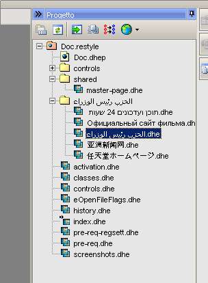
How to use the control: (See the sample)
If you use icons on nodes, add icons to the internal image list using the [AddIcon] function;
if you don't need icons turn the [AutoInitImageList] property to "False" so you'll save space
- Create a private enum on your form for image index so it's simple for you to add nodes with images (if you use images)
- Use the [AddNode] function to add nodes
Private Sub pvSetupTreeview()
    With ucTreeView1

        .ItemHeight = 16
        .HasButtons = True
        .HasLines = True
        .HasRootLines = True

        'Aggiunge le varie icone
        Dim i As Integer
        For i = 0 To 1
            .AddIcon img_icons(i).Picture.Handle
        Next

        .Font.Name = "Tahoma"
    End With
End Sub

Private Sub pvLoadTreeview()
    Dim hRootNode As Long

    Dim osf As clsSearchFiles
    Set osf = New clsSearchFiles

    'Return a Hieranchical collection
    Dim oc As Collection
    Set oc = osf.SearchInPath(moCW.UniAppPath, esfw_all, True, False, False, , True)

    miActualCounter = 0

    With ucTreeView1
        .SetRedrawMode False
        .Clear

        hRootNode = .AddNode(, , "RootNode", "This Path", 0, 0)

        pvLoadFolder hRootNode, oc

        .Expand hRootNode
        .SetRedrawMode True
    End With
End Sub

Private Sub pvLoadFolder(hParent As Long, oc As Collection)
    Dim i As Long
    Dim osfi As clsSearchFilesFInfo
    Dim hNode As Long

    For i = 1 To oc.Count
        Set osfi = oc(i)

        miActualCounter = miActualCounter + 1

        If osfi.IsDirectory Then
            hNode = ucTreeView1.AddNode(hParent, , "F" & miActualCounter, osfi.sFileName, 0, 0, , osfi.sPathFileName)

            pvLoadFolder hNode, osfi.oCollSubFiles
        Else
            hNode = ucTreeView1.AddNode(hParent, , "F" & miActualCounter, osfi.sFileName, 1, 1, , osfi.sPathFileName, IIf((i Mod 2) = 0, vbRed, -1&))

        End If

    Next

End Sub